How to build a mobile-optimized e-commerce website
December 28, 2023
Table of contents
Quick Access

Mobile devices have become an integral part of our lives, so it has become essential for online business owners to adapt to this trend to give their companies a greater reach.
Building a mobile-optimized e-commerce website not only improves user experience, but can also boost sales and brand visibility. That's why we present some tips and best practices to ensure that your e-commerce website is attractive and functional on mobile devices.

Recommendations for creating an e-commerce website that is optimized for mobile phones
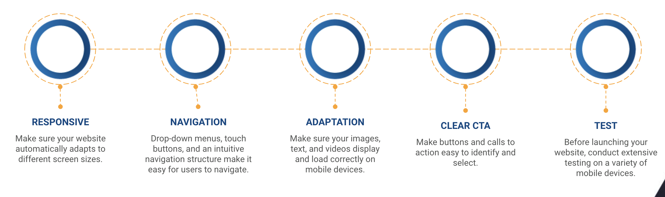
1. Responsive design
A responsive web design is the foundation of any successful mobile e-commerce site. Ensure your website automatically adapts to different screen sizes, ensuring a consistent user experience across mobile, tablet and desktop devices.
“The first step to creating a responsive e-commerce web design is to use a flexible design that can adjust to the width and height of the window. A flexible layout is made up of relative units, such as percentages, ems, or rems, rather than absolute units, such as pixels or points. This way you can avoid horizontal scrolling and ensure your content fits into the available space. You can also use CSS grid or flexbox to create responsive grids and align your elements in different ways”, they detailed in a LinkedIn article.
2. Optimized loading speed
Loading speed is crucial on mobile devices. Users tend to abandon an e-commerce website if it takes too long to load. Optimizes images, uses caching, and minifies code to ensure fast and efficient performance.
3. Simple navigation
Simplifies navigation for touch devices. Drop-down menus, touch buttons, and an intuitive navigation structure make it easy for users to find what they are looking for effortlessly on an e-commerce website. Avoid complicated menus and endless scrolls that can frustrate visitors.
“People have specific goals when they visit your site. Like learning more about your company or purchasing a product. Well-structured navigation helps people achieve whatever goals they have. But if people can't complete your goal, they're likely to bounce (leave without visiting other pages or completing some other action on your site). And that negative experience can cost you”, they warned in a Semrush article.

4. Simplified forms
If your site requires forms for registration or purchase, simplify the processes as much as possible. Mobile e-commerce users do not want to waste time completing long forms on small screens. Implement options such as autofill to facilitate the process.
5. Mobile-friendly content
Optimize content for smaller screens. Make sure your images, text, and videos display and load correctly on mobile devices. Well-tailored content improves readability and user retention.
6. Clear buttons and calls to action (CTAs)
Make buttons and calls to action easy to identify and select. Use a bold size and color for your buttons, and make sure they are strategically placed to encourage user interaction.
7. Security and ease of payment
Security is a constant concern, especially in online transactions. Ensure your e-commerce website is equipped with SSL certificates to protect customer information. It also facilitates the payment process through popular and secure mobile payment options.
“Mobile payments are among the most secure forms of commerce. This is because they are performed on mobile devices which tend to require some form of authentication, usually in the form of a fingerprint, facial recognition, or password. The devices also encrypt their transmissions, giving thieves minimal opportunity to intercept customer data”, they noted in a Shopify article.
8. Testing on multiple devices
Before launching your website, conduct extensive testing on a variety of mobile devices. Make sure the user experience is consistent across different models and operating systems to reach the widest audience possible.
9. Mobile Search Engine Optimization (SEO)
Don't underestimate the power of mobile SEO when it comes to an e-commerce website. Make sure your website is optimized for mobile searches, as Google and other search engines prioritize mobile-friendly websites in their results.

10. Analysis and continuous improvement
Use analytics tools to monitor your website's performance on mobile devices. Examine traffic, conversions, and dwell time metrics to identify areas for improvement and continually adjust your strategy.
Building a mobile-optimized e-commerce website is essential in today's digital landscape. Taking a user-centric approach, from responsive design to content optimization and security, can make the difference in customer retention and the long-term success of your online business.
With mobile technology constantly evolving, staying up to date with best practices ensures your website remains relevant and effective.
Do you need a team of software developers specialized in e-commerce? At Rootstack, we have +13 years of experience supporting companies in their digital transformation. Contact us!
We recommend you this video
Related Blogs
-1.17.37-p.m.png "aws")
We look at how AWS tools help you optimize costs
-10.38.35-a.m.png "computacion en la nube")
The basics of cloud computing
-9.19.54-a.m.png "outsourcing de ti")
How IT outsourcing services can unlock your project in the retail industry
-5.03.33-p.m.png "desarrolladores de aplicaciones moviles")
How to explain your project requirements to external mobile app developers
-2.51.54-p.m.png "desarrollo de software personalizado")
Scenarios in which companies should develop custom software
-11.27.07-a.m.png "stevie award")