Android Material Design: Styles
June 18, 2021
Table of contents
Quick Access
In the development of mobile applications often we spend a lot of time trying to stylize our applications so that the interface is pleasant for the user and easy to program. Today, this condition has changed thanks to the creation of a visual language that summarizes the basic principles of good design innovation, saving a lot of time in the development of the styles, we are talking about Material Design.
Material Design is a design language that provides order, clear specifications, and striking colors and images to the user interface of Android applications animations.
To give a broader sense, we can see the material design as a set of very clear rules to be put into practice very striking designs and interfaces and of high quality.
More and more applications are incorporating this philosophy to its interfaces, and it is no wonder that the trend today is due to the excellent results it provides and of course, as users, we like it a lot.
This concept was intended primarily for the current version of Android, Lollipop, but has also been used on websites, having a good user acceptance.
The most interesting of Material Design in Android is that, despite being available from the API level 21, can be integrated into the lower levels thanks to the support library **appcompat_v7**. So, if we start a new project or upgrade the interface of our Android application, we must add *build.gradle* library to our **Android Studio**.
[prism:javascript] dependencies { compile fileTree(dir: 'libs', include: ['*.jar']) compile 'com.android.support:appcompat-v7:21.0.3' } [/prism:javascript]
In this way we can start our design update to the material.
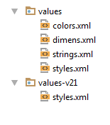
First, it should be noted that in the *API 21*, Android reshapes apply styles, so we must create a style file for this level. This file will be under the *values-21* directory, like this:
Then the application base style is created, in this case we use the reference **AppCompat**, we will give a *Light* style without *ActionBar* (has been replaced by *toolBar* and its implementation is different).
In the values directory, open and modify the file *styles.xml*
[prism:javascript] [/prism:javascript]
To apply this theme, we must change the parental Base Application theme created by default [prism:javascript] [/prism:javascript]
You should check that the Android theme of the application in AndroidManifest.xml has the value: [prism:javascript] android:theme="@style/AppTheme" [/prism:javascript]
One of the main design elements of the material is **color**, for which there is special documentation that explains in detail how to use.
Basically we have three colors:
- colorPrimary
- colorAccent
- colorPrimaryDark
**colorPrimary** will be our *toolBar* color and main color of our app, the **colorAccent** will be used for components such as *action button, sliders , switches o textos de link* or more which need to be highlighted.
**colorPrimaryDark** is the color of the notifications bar and will be used only for devices which have Android Lollipop, since from these version is when the color may be modified.
Knowing these concepts, let's put color in our materials! [prism:javascript] [/prism:javascript]
And the file colors.xml
[prism:javascript]
In this way we ready our equipment fully oriented design style.
As mentioned above, the *API level 21* is special, so under the directory *values-21* we must make special changes to the file *styles.xml*
[prism:javascript] [/prism:javascript]
First, is taken as *"parent"* the theme created earlier and names of associated items each color are changed; you must add *"android"* before the name of the color, is the way to call these colors at the *21 level*.
Then it only remains to add a toolbar, buttons, text, and all the materials we need in our application.
As you can see, it is very simple to implement a basic theme to our Android applications to create interfaces that have the material design.
Many companies developing mobile applications are updating their apps with this design methodology, Material Design is one of the great improvements that brings the level 21 Android: a fresh new design that replaces the highly appointed *Holo* , which has managed to lay the foundations for the Android design guidelines. But it is time to bring new life to the user interfaces of mobile and tablets that use this operating system.